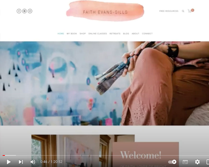
Join me for the second video in my series of free coaching recordings, with the wonderful Faith Evans-Sills, an artist, painting teacher and retreat facilitator from Charleston, South Carolina. Have you seen her work? It’s stunning! Check out her inspiring Instagram account as well here: instagram.com/faithevanssill
You can follow along with her website here: faithevanssills.com
Some key takeaways:
• As an artist or creative type (or anyone really), you have to ask yourself, what is the purpose of your website? Is it to build your profile as an artist/creative or is it to serve and sell. If it is the latter (I do recommend this), then you’ll want to make sure your centre your message around speaking to your ideal client from the get-go. You want the reader to feel like they are the hero of the website and you are their guide. People are absolutely going to be naturally drawn to Faith just because her work and her photos are so beautiful, but let’s take it a step further than that. I suggested we bring up Faith’s message further down the home page: “Are you ready to embrace the creativity you know you were made for?” or something similar in the first section of her home page.
• For Faith’s logo, while I like that we get the painterly feel and the beautiful color, but I feel like she could do so much more with this to make it feel unique. I think the typography could use some work so it has some more soul and infused with her bohemian aesthetic. Maybe she can explore some font pairing? The brush stroke also feels super dominant. Like too in your face to me. So maybe she can bring in a painterly element that speaks to what she does but is more subtle.
• In the second section Faith talks about being a “Lover of Bright Color” and yet, her primary brand colour on this website is the pink clay type colour, which to me is much more muted. So I thought that was an interesting observation. I wonder if it would feel more aligned to have some more bright colour infused in her site in ways other than just the photos of her work.
• I’d also love to see pieces of Faith’s art coming into the website like as little graphic elements or as textural elements. This is a fine skill to bring these elements in without it feeling too busy, but I think it would bring her website to life more.
• When it comes to upper case text, be careful to use it in small doses. The usage of upper case in Faith’s ‘Welcome’ section feels too intense to me and it can feel like shouting/is harder to read.
• For Faith’s Email opt-in section, it’s feeling quite subdued, even down to using the black and white photo, which is not a photography style she has otherwise used. I’d love to see more vibrancy and simplicity come through here.
• Faith can consider organising her classes a bit more. She has about 15 classes and then several retreats. How should someone who is brand new to her world decide what is the best fit for them? How can you help facilitate that clarity? I would also love to see the promotional images for her classes cleaned up a bit and perhaps a more modernised font style, bringing in more of her bohemian aesthetic.
• I would avoid sliding images that you have to click to scroll through. People don’t like clicking to scroll these days. It’s quite a time consuming to get to the content and we all want immediate access these days! I would rather you have a longer page people can easily scroll down through than to make people keep clicking on things. Clicking feels tiring.
• I would consider moving older past retreats further down her retreat page to ensure that the upcoming retreats are more clear and then some lovely details about the retreats experience further up on the page.
Would you like to have one of these videos for your own brand? Apply here
