I recommend enough colours for variety and contrast, but not too many that your brand no longer feels consistent.
Let’s have a look at some of my client’s palettes for inspiration and eye candy and then I’ll detail exactly what you should be thinking about when formulating your brand’s palette after that.
Andrea Scher
Vibe: Joyful, Alive, Creative, Relaxed
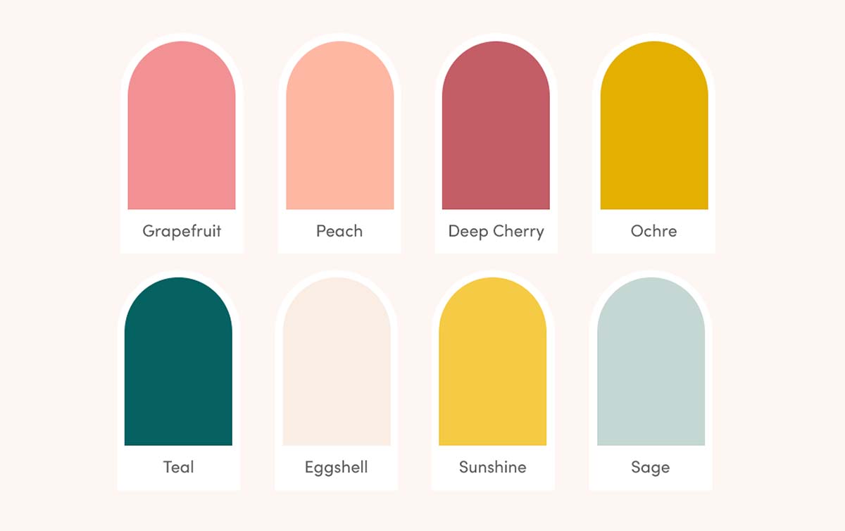
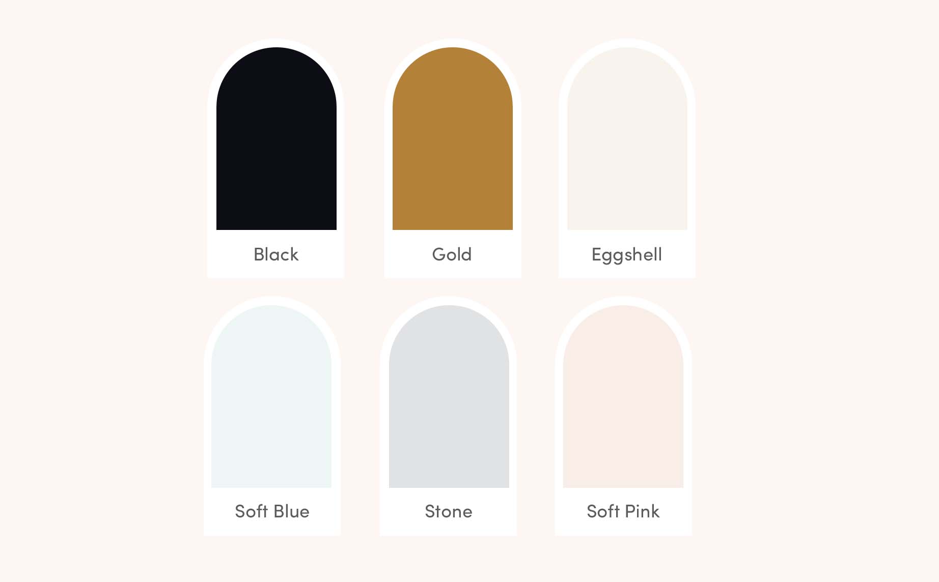
Natajsa Wagner
Vibe: Natural, Earthy, Safe, Professional
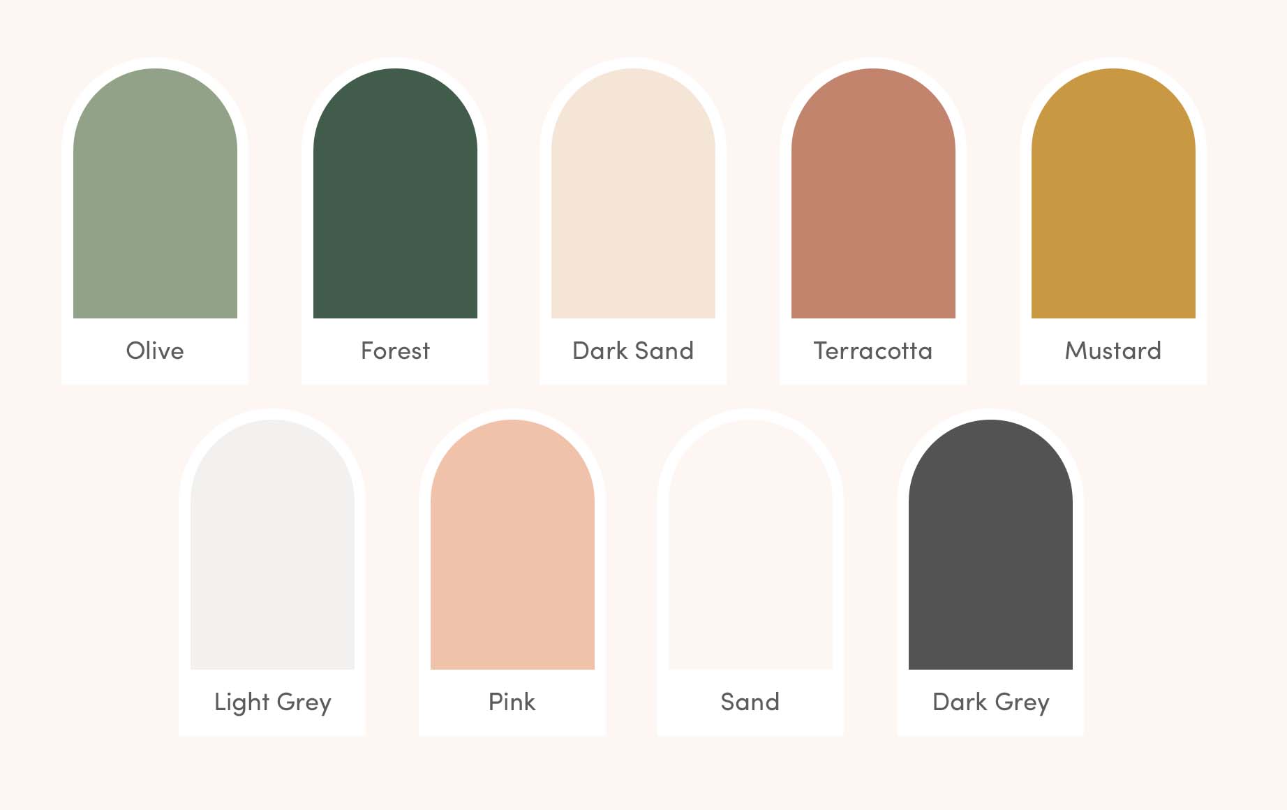
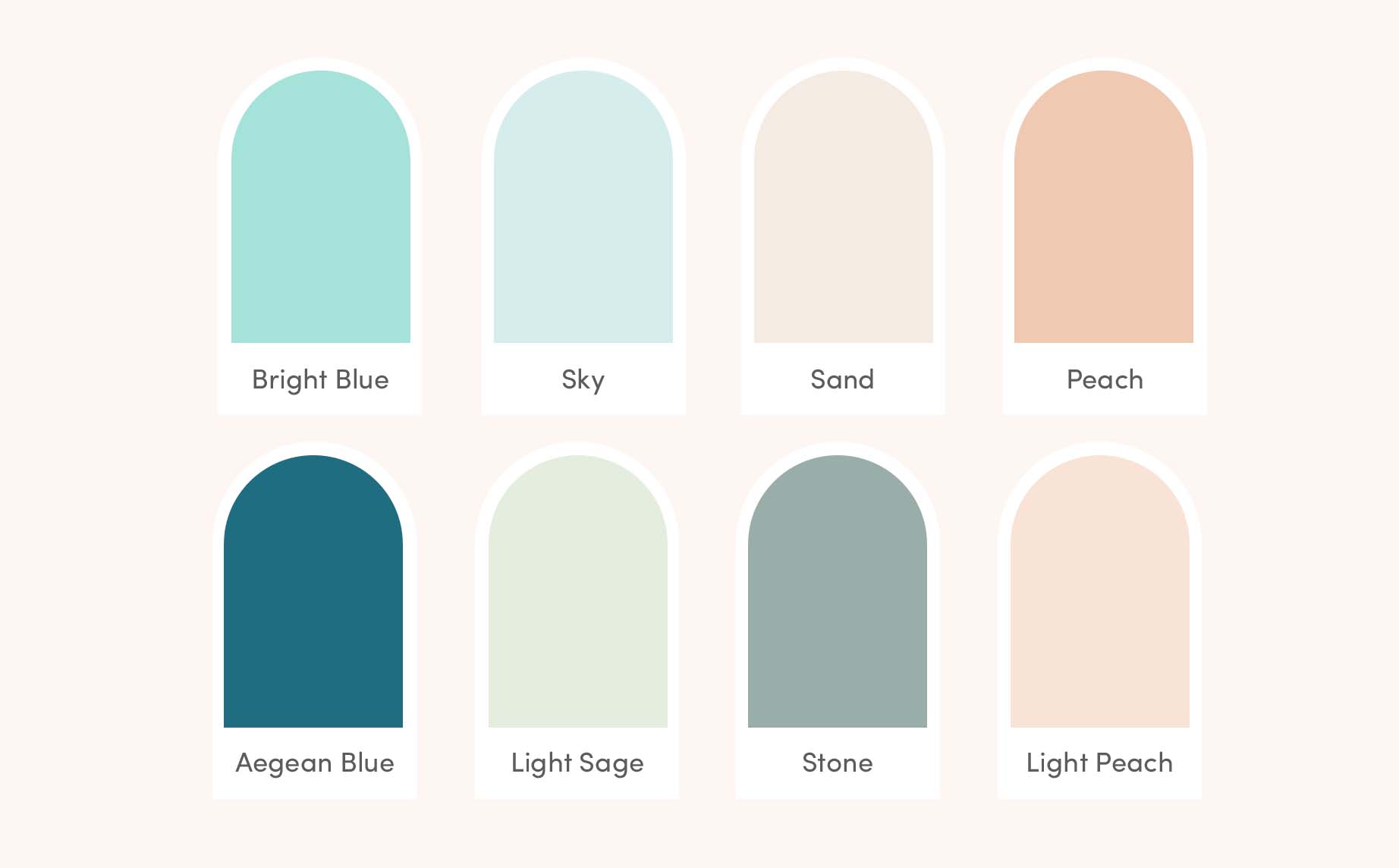
Private Label Skin Care
Vibe: Natural, Earthy, Safe, Professional
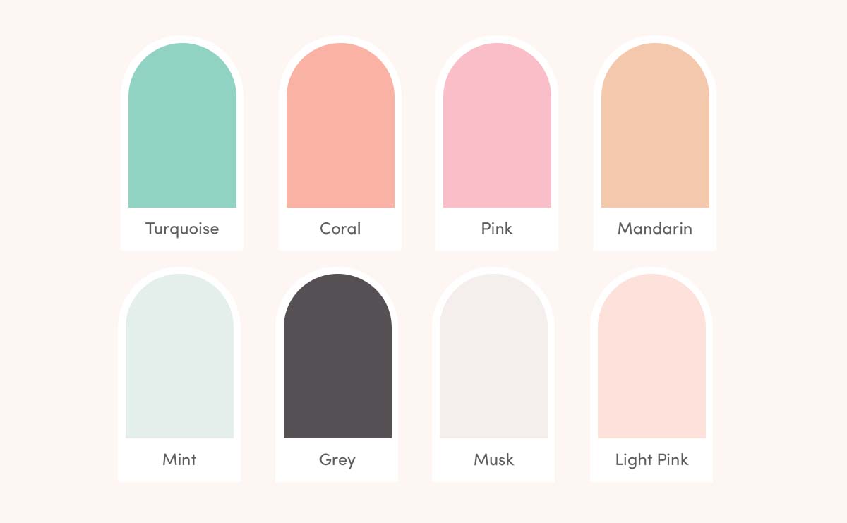
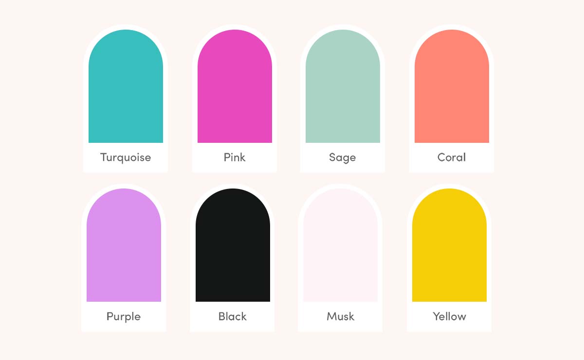
Kelly Rae Roberts
Vibe: Possibility, Joyful, Creative, Soulful
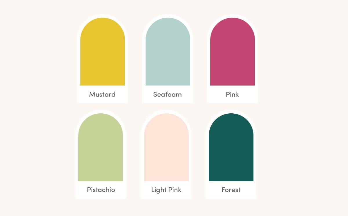
School of Inner Work
Vibe: Possibility, Joyful, Creative, Soulful
Jane Davenport
Vibe: Happy, Generous, Whimsical
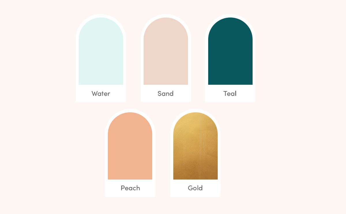
Lumos Trauma
Vibe: Compassionate, Experienced, Calming
SARK
Vibe: Loving, Inspirational, Joyful
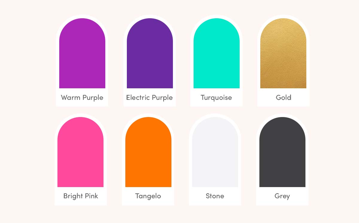
Wholistic Life Renewal
Vibe: Authentic, Intuitive, Inspiring
1. Start with one HERO colour
The colour you want to be known for and recognised by. If you think about all the major brands, they probably have a hero colour you remember. While you’ll probably want it to be a colour you LOVE, you’ll also want to think about what meanings/associations that colour has, to ensure it aligns with your message. How do you want your clients to feel? Decide on that first and work backward from there to create your colour palette, balancing MEANING with what looks great.
2. Support it with secondary colours
If you were to use your hero colour as a background colour, what colour(s) could you use to contrast it, such as for a Call to Action Button (button where you want someone to do something). You want colours which are going to pair well together. I often find clients like two individual colours, but don’t like them in combination. Not everything needs to work together, but this does need to be taken into consideration. For example, maybe you love yellow and red, but the combo is giving you unwanted McDonald’s vibes.
3. Build in light neutrals
It is really handy to have one or two very light neutrals. We don’t always want in your face coloured backgrounds. However, clear sectioning and segmenting on you website is super important for readability. I.e. one white section, one section with a background. Having a light neutral like a light grey, light pink, cream etc is really handy for some subtle segmentation, paired in with the odd bright section or without if your brand vibe is more neutral.
4. Have a dedicated text colour
I’ll often specify a text colour, that we may or may not use elsewhere in the branding. For example, you may want to use a dark grey for text or maybe a dark green, but you’re not going to use a big background section of dark grey.