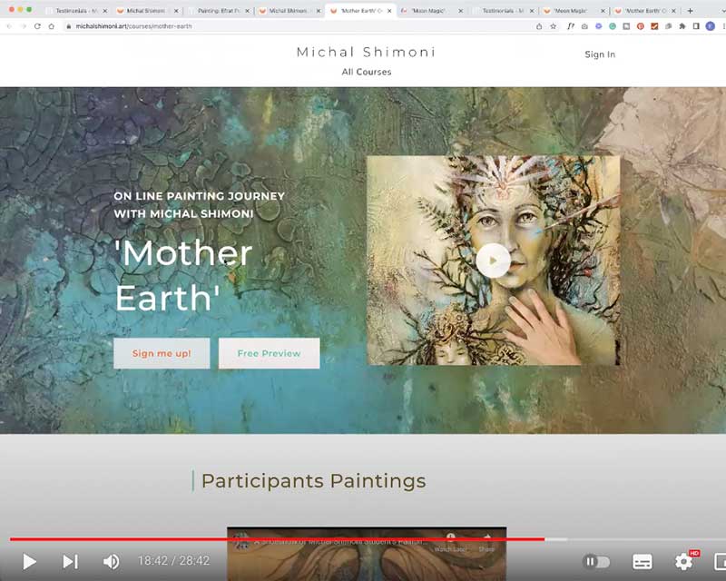
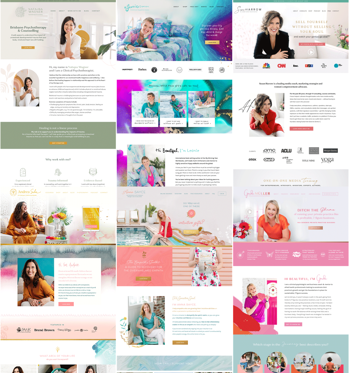
In this video, I do a brand coaching and website review of Michal Shimoni’s site. Michal is an artist and art mentor who wanted to know how to bring back more life to her website. You can check her site and gorgeous artwork out at: https://shimoni-m.com/ and https://www.michalshimoni.art.You may be able to relate, having a site that doesn’t really feel like you (perhaps beyond the images of your work or photos of yourself). So how do you embed your energy and personality onto the page, BEYOND your artwork or personal imagery? And what other strategic changes need to be considered to make a site clearer and easier to navigate?
Some of the things we discuss:
• How she has two separate websites, one for her general brand and one on Thinkific that houses her course sales pages. I talk about considerations with that approach and whether it should be streamlined (ideally, yes).
• To consider bringing the beautiful energy of her artwork and the vibe from her fabulous videos into her actual visual brand, including logo and website, so it doesn’t feel like a generic website template.
• Readjusting her gallery page and making it clearer that she actually has artwork for sale on the home page and menu.
• Thinking more strategically about what domain name she uses.
• Ensuring all her copy is in first person (written like she’s actually the one writing it) and goes deeper to convey her message, her beliefs and values and why she paints females inspired by nature and shamanic work and how working with these spirits and archetypes can help her students.


